
How to Optimize Website Images: The Complete 2026 Guide
Images engage users, drive clicks, and generally make everything better–except for performance. Images are giant blobs of bytes that are usually the slowest part of your website. This guide has everything you need to know to optimize them for fast and responsive images for a fast, responsive website.

Why optimized images matter for web performance
Images are big. Really big. The bytes required for an image dwarf most site’s CSS and JavaScript assets. Slow images will damage your Core Web Vitals, impacting your SEO and costing you traffic. Images are usually the element driving Largest Contentful Paint and load delays can increase your Cumulative Layout Shift. If you’re not familiar with these metrics, check them out in the Definitive Guide to Measuring Web Performance.
To make your images fast, you need to make them as small as possible. The trick is making them small, while keeping them looking sharp and nice. This guide is for you! We’ll cover all the ways to make your images smaller:
Website image optimization checklist:
- Choose the right image format – Use JPG for photos, PNG for graphics, and modern formats like WebP or AVIF for better compression and quality.
- Optimize image size and metadata – Compress images with tools like TinyPNG and ImageMin, and remove unnecessary metadata to reduce file size.
- Lazy-load below-the-fold images – Use the loading=”lazy” attribute to delay loading non-critical images until they are needed, improving page speed.
- Use responsive images – Implement srcset and picture elements to serve different image sizes based on the user’s screen resolution.
- Switch to images optimized for mobile – Use media queries and aspect-ratio adjustments to serve mobile-friendly images without unnecessary large file sizes.
- Embed critical images – Convert small, essential images like icons and logos into Base64 or inline SVG to eliminate extra network requests.
- Cache and host images efficiently - Host your images from a CDN that serves with HTTP/2 or HTTP/3 and proper caching headers.
Want faster load times? Follow these steps and check your real-world performance with Request Metrics.
1. Choose the right image format
There are several different ways an image file can be formatted, like JPG or PNG. These formats are not interchangeable, and they were designed for different kinds of images. Using the wrong format can make a big image even worse. Let’s look an example, check out this image of Sam the Sloth:

This image is over twice as large when formatted as a JPG! The PNG format is much better for illustrations like this. A good general rule is to use JPG for photographs and use PNG for graphics. Let’s have a look at another image, a photograph:

Notice how graphic illustrations tend to be significantly smaller than photographs. Be sure to consider this when designing the look and feel of your pages.
PNG vs JPG vs WebP vs AVIF
Choosing the right image format helps balance quality and performance. Each format has strengths and trade-offs, so the best choice depends on your image type:
- JPG (JPEG) – Best for photos. JPG uses lossy compression, making it ideal for photographs and images with lots of colors and gradients. It offers smaller file sizes but may lose some detail if compressed too much.
- PNG – Best for graphics and transparency. PNG supports lossless compression and transparency, making it perfect for logos, icons, and detailed graphics. However, PNG files can be significantly larger than JPGs for detailed images like photography.
- WebP – Modern alternative for smaller files. WebP offers both lossy and lossless compression, often producing smaller file sizes than JPG and PNG while maintaining high quality. It’s widely supported in modern browsers and recommended for most images, although can be difficult to manipulate.
- AVIF – Best for maximum compression and quality. AVIF provides even better compression than WebP while preserving image quality. It supports transparency and HDR but isn’t yet universally supported across all browsers.
Best practice: Keep your original images in JPG or PNG, then use a build tool or CDN (like BunnyCDN) to automatically convert and serve them as WebP or AVIF for modern browsers.
Vector images (AKA SVG)
Vector images are a little different. Rather than storing the contents of the image, they store the instructions for how to draw it in XML. For simple illustrations, this tends to be very efficient, and enables a large image to be shown very efficiently. Here’s an example:

Because a vector describes how to draw an image, it can be shown at any size without any increase in size or reduction in quality.
A common mistake with vectors is trying to convert existing images. Exporting a PNG illustration as a SVG does not convert it to a vector! Likely, you just embedded a PNG inside the SVG XML and it will be slightly larger than the original file. SVGs have to be created from original paths and lines using a tool like Adobe Illustrator.
Get your free speed check to see your website performance for real users.
Free speed test
2. Optimize image quality
Aside from image format, there are often settings to adjust the quality of the image using lossy compression. These are algorithms that remove parts of an image that you wouldn’t notice, but still take up space. Check out this example:
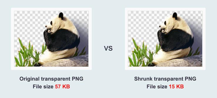
This reduction is accomplished by pulling out unused colors, or by combining colors and pixels that too similar to notice. But you don’t need to worry about that, most optimization tools can detect the appropriate level of quality for an image. TinyPNG and ImageMin are great for this.
3. Lazy-Load below-the-fold images
Websites have a lot of images that don’t need to be loaded right away. But the browser doesn’t know what images it will need, so its gotta download them all! Downloading the extra images creates lag and network congestion that slows down the critical images.
Instead, tell the browser to be lazy! Lazy-loading is a technique to tell the browser to wait to download certain images until they are visible to the user. This can have huge impacts to Largest Contentful Paint (LCP) performance because the browser can focus on the critical elements to render.
Fortunately, the HTML spec let’s us tell the web browser that an image isn’t needed right away and it can lazy load it, with the loading attribute. This is really useful for images that are not immediately visible “above the fold”.
<picture>
  <img src="some-big-image.png"
    alt="Image description" width="1600" height="600"
    loading="lazy" />
</picture>
This will instruct the browser to wait to download the image until it is almost visible to the user.
Controlling load order with fetchpriority
You can even more fine-grained control of how images are downloaded using the fetchpriorty attribute. This tells the browser what order to download images in, separately from how they appear in the markup.
<picture>
  <img src="hero-image.png"
    alt="Image description" width="1600" height="600"
    fetchpriority="high" />
</picture>
For example, if your hero image is also your LCP Element, you probably want to set fetchpriority="high", so that it downloads as fast as possible.
Browser-compatibility
Both loading and fetchpriorty are supported in the latest major browsers, but if you want to have compatibility with older devices, you can polyfill lazy-loading behavior yourself with some short JavaScript:
<img data-src="some-big-image.png"
  alt="Image description" width="1600" height="600" />

<script>
  const lazyImages = [...document.querySelectorAll("[data-src]")];

  const imageObserver = new IntersectionObserver((entries) => {
    for(const entry of entries) {
      if (entry.isIntersecting) {
        const img = entry.target;
        const src = img.getAttribute("data-src");

        if (!img.src && src) {
          img.src = src;
        }

        imageObserver.unobserve(img);
      }
    }
  });

  for(const img of lazyImages) {
    imageObserver.observe(img);
  }
</script>
This code looks for images that have a data-src attribute instead of a src one, so that the images don’t load right away. Then, it uses IntersectionObserver to detect when the images have intersected the viewport, and switches the attribute to src, where it will download normally.
Layout sizing
With lazy-loading images, it is even more important to specify the sizing of images to prevent Layout Shift. Layout shifts are when the positioning of elements changes during load because of dynamically sized content. Read more about layout shift and the impact on performance.
You prevent this by specifying a height and width attribute on your images.
<img src="picture-1200.jpg"
  loading="lazy" class="lazy"
  width="1200" height="900" />
Notice that the height and width attributes. It’s not 1200px, it’s just 1200. It also doesn’t do exactly what you’d expect–the size of this element will not necessarily be 1200x900, it will be whatever the CSS styling and layout says it needs to be. But the browser remembers the aspect ratio from these attributes so that the height of an image will be correct given it’s width.
So if your layout only has 800px wide for the image, the browser will know, without downloading the image, to reserve 600px of height as well to maintain the aspect ratio.
4. Use responsive images
Visitors will view your website at different sizes. Some of your users will have a huge 1600px wide display. Others may have a 720px tablet or a 600px phone. A 2800px wide image would need a lot of wasteful bytes for those smaller devices, where the image will get scaled down anyway.

Responsive images let you keep that beautiful, high resolution image for visitors with large displays, and efficiently scale it down or replace the image for other devices. You can do this with the picture and source elements. Here’s an example where a 1600px wide image can be served at smaller 1200px or 700px sizes, depending on the size of the visitor’s screen:
<picture>
  <source
    sizes="(max-width: 1600px) 100vw, 1600px"
    srcset="hero-desktop-700.png    700w,
            hero-desktop-1200.png  1200w,
            hero-desktop-1600.png  1600w" />
  <img src="hero-desktop-1600.png"
    alt="Image description" width="1600" height="600" />
</picture>
In the example above, we wrapped the img tag in a picture element that let’s us specify alternate sources based on media queries. The sizes attribute says that for all screen sizes up to 1600px, use an image that is 100% of the viewport width. The srcset attribute defines all the sizes of the image that we have. The first part is the URL and the second is the width of the image.
Most image tools, like Photoshop, Gimp, and Paint.NET, can export images at multiple resolutions. Your native image viewer can probably do some limited resizing as well. To automate this on a large scale, you may want to consider a command line tool like ImageMagick.
Let’s look at a real example. A visitor loads the size with a screen 800px wide, the browser loo would look for an image at least 800px, aad the first one it finds is hero-desktop-1200.png, so it loads that one.
5. Switch to images optimized for mobile
For some websites, you may want to show a different image on mobile that has a different aspect ratio. Or maybe you want to hide the image altogether? Setting a display:none style on the image isn’t very helpful because the browser will still waste time and bytes downloading the image. Instead, you can use multiple source elements to tell the browser what image to show, and when.
<picture>
  <source
    media="(max-width: 700px)"
    sizes="(max-width: 300px) 0, 100vw"
    srcset="hero-mobile-400.png   400w,
            hero-mobile-600.png   500w,
            hero-mobile-700.png   700w" />
  <source
    media="(min-width: 701px)"
    sizes="(max-width: 1600px) 100vw, 1600px"
    srcset="hero-desktop-700.png    700w,
            hero-desktop-1200.png  1200w,
            hero-desktop-1600.png  1600w" />
  <img src="hero-desktop-1600.png"
    alt="Image description" width="1600" height="600" />
</picture>
In this second example, the first source applies for screens less than 700px wide because of the media attribute. For those screens, if it is less than 300px, the width of the space is 0, so the browser knows not to bother downloading anything. For anything greater than 300, its 100% of the viewport, and it has a set of hero-mobile-X.png images to choose from.
Once the screen is greater than 700px, the next source element applies and shows a hero-desktop-X.png image for the correct width.
6. Embed critical images
Sometimes an image is essential for a webpage to be useful, such as a button, logo, or icon. Once you’ve optimized it as small as you can make it, the only way to go faster is to embed the image on the page. Embedding an image saves the initial network request time and shows an image as soon as the document starts rendering.
You embed an image by converting it into a base64 string and putting it right in the html tag, like this:
<img src="data:image/png;base64,iVBORw0KGgoAAAANSUhEUgAAABQAAAAUCAMAAAC6V+0/AAAABGdBTUEAALGPC/xhBQAACklpQ0NQc1JHQiBJRUM2MTk2Ni0yLjEAAEiJnVN3WJP3Fj7f92UPVkLY8LGXbIEAIiOsCMgQWaIQkgBhhBASQMWFiApWFBURnEhVxILVCkidiOKgKLhnQYqIWotVXDjuH9yntX167+3t+9f7vOec5/zOec8PgBESJpHmomoAOVKFPDrYH49PSMTJvYACFUjgBCAQ5svCZwXFAADwA3l4fnSwP/wBr28AAgBw1S4kEsfh/4O6UCZXACCRAOAiEucLAZBSAMguVMgUAMgYALBTs2QKAJQAAGx5fEIiAKoNAOz0ST4FANipk9wXANiiHKkIAI0BAJkoRyQCQLsAYFWBUiwCwMIAoKxAIi4EwK4BgFm2MkcCgL0FAHaOWJAPQGAAgJlCLMwAIDgCAEMeE80DIEwDoDDSv+CpX3CFuEgBAMDLlc2XS9IzFLiV0Bp38vDg4iHiwmyxQmEXKRBmCeQinJebIxNI5wNMzgwAABr50cH+OD+Q5+bk4eZm52zv9MWi/mvwbyI+IfHf/ryMAgQAEE7P79pf5eXWA3DHAbB1v2upWwDaVgBo3/ldM9sJoFoK0Hr5i3k4/EAenqFQyDwdHAoLC+0lYqG9MOOLPv8z4W/gi372/EAe/tt68ABxmkCZrcCjg/1xYW52rlKO58sEQjFu9+cj/seFf/2OKdHiNLFcLBWK8ViJuFAiTcd5uVKRRCHJleIS6X8y8R+W/QmTdw0ArIZPwE62B7XLbMB+7gECiw5Y0nYAQH7zLYwaC5EAEGc0Mnn3AACTv/mPQCsBAM2XpOMAALzoGFyolBdMxggAAESggSqwQQcMwRSswA6cwR28wBcCYQZEQAwkwDwQQgbkgBwKoRiWQRlUwDrYBLWwAxqgEZrhELTBMTgN5+ASXIHrcBcGYBiewhi8hgkEQcgIE2EhOogRYo7YIs4IF5mOBCJhSDSSgKQg6YgUUSLFyHKkAqlCapFdSCPyLXIUOY1cQPqQ28ggMor8irxHMZSBslED1AJ1QLmoHxqKxqBz0XQ0D12AlqJr0Rq0Hj2AtqKn0UvodXQAfYqOY4DRMQ5mjNlhXIyHRWCJWBomxxZj5Vg1Vo81Yx1YN3YVG8CeYe8IJAKLgBPsCF6EEMJsgpCQR1hMWEOoJewjtBK6CFcJg4Qxwicik6hPtCV6EvnEeGI6sZBYRqwm7iEeIZ4lXicOE1+TSCQOyZLkTgohJZAySQtJa0jbSC2kU6Q+0hBpnEwm65Btyd7kCLKArCCXkbeQD5BPkvvJw+S3FDrFiOJMCaIkUqSUEko1ZT/lBKWfMkKZoKpRzame1AiqiDqfWkltoHZQL1OHqRM0dZolzZsWQ8ukLaPV0JppZ2n3aC/pdLoJ3YMeRZfQl9Jr6Afp5+mD9HcMDYYNg8dIYigZaxl7GacYtxkvmUymBdOXmchUMNcyG5lnmA+Yb1VYKvYqfBWRyhKVOpVWlX6V56pUVXNVP9V5qgtUq1UPq15WfaZGVbNQ46kJ1Bar1akdVbupNq7OUndSj1DPUV+jvl/9gvpjDbKGhUaghkijVGO3xhmNIRbGMmXxWELWclYD6yxrmE1iW7L57Ex2Bfsbdi97TFNDc6pmrGaRZp3mcc0BDsax4PA52ZxKziHODc57LQMtPy2x1mqtZq1+rTfaetq+2mLtcu0W7eva73VwnUCdLJ31Om0693UJuja6UbqFutt1z+o+02PreekJ9cr1Dund0Uf1bfSj9Rfq79bv0R83MDQINpAZbDE4Y/DMkGPoa5hpuNHwhOGoEctoupHEaKPRSaMnuCbuh2fjNXgXPmasbxxirDTeZdxrPGFiaTLbpMSkxeS+Kc2Ua5pmutG003TMzMgs3KzYrMnsjjnVnGueYb7ZvNv8jYWlRZzFSos2i8eW2pZ8ywWWTZb3rJhWPlZ5VvVW16xJ1lzrLOtt1ldsUBtXmwybOpvLtqitm63Edptt3xTiFI8p0in1U27aMez87ArsmuwG7Tn2YfYl9m32zx3MHBId1jt0O3xydHXMdmxwvOuk4TTDqcSpw+lXZxtnoXOd8zUXpkuQyxKXdpcXU22niqdun3rLleUa7rrStdP1o5u7m9yt2W3U3cw9xX2r+00umxvJXcM970H08PdY4nHM452nm6fC85DnL152Xlle+70eT7OcJp7WMG3I28Rb4L3Le2A6Pj1l+s7pAz7GPgKfep+Hvqa+It89viN+1n6Zfgf8nvs7+sv9j/i/4XnyFvFOBWABwQHlAb2BGoGzA2sDHwSZBKUHNQWNBbsGLww+FUIMCQ1ZH3KTb8AX8hv5YzPcZyya0RXKCJ0VWhv6MMwmTB7WEY6GzwjfEH5vpvlM6cy2CIjgR2yIuB9pGZkX+X0UKSoyqi7qUbRTdHF09yzWrORZ+2e9jvGPqYy5O9tqtnJ2Z6xqbFJsY+ybuIC4qriBeIf4RfGXEnQTJAntieTE2MQ9ieNzAudsmjOc5JpUlnRjruXcorkX5unOy553PFk1WZB8OIWYEpeyP+WDIEJQLxhP5aduTR0T8oSbhU9FvqKNolGxt7hKPJLmnVaV9jjdO31D+miGT0Z1xjMJT1IreZEZkrkj801WRNberM/ZcdktOZSclJyjUg1plrQr1zC3KLdPZisrkw3keeZtyhuTh8r35CP5c/PbFWyFTNGjtFKuUA4WTC+oK3hbGFt4uEi9SFrUM99m/ur5IwuCFny9kLBQuLCz2Lh4WfHgIr9FuxYji1MXdy4xXVK6ZHhp8NJ9y2jLspb9UOJYUlXyannc8o5Sg9KlpUMrglc0lamUycturvRauWMVYZVkVe9ql9VbVn8qF5VfrHCsqK74sEa45uJXTl/VfPV5bdra3kq3yu3rSOuk626s91m/r0q9akHV0IbwDa0b8Y3lG19tSt50oXpq9Y7NtM3KzQM1YTXtW8y2rNvyoTaj9nqdf13LVv2tq7e+2Sba1r/dd3vzDoMdFTve75TsvLUreFdrvUV99W7S7oLdjxpiG7q/5n7duEd3T8Wej3ulewf2Re/ranRvbNyvv7+yCW1SNo0eSDpw5ZuAb9qb7Zp3tXBaKg7CQeXBJ9+mfHvjUOihzsPcw83fmX+39QjrSHkr0jq/dawto22gPaG97+iMo50dXh1Hvrf/fu8x42N1xzWPV56gnSg98fnkgpPjp2Snnp1OPz3Umdx590z8mWtdUV29Z0PPnj8XdO5Mt1/3yfPe549d8Lxw9CL3Ytslt0utPa49R35w/eFIr1tv62X3y+1XPK509E3rO9Hv03/6asDVc9f41y5dn3m978bsG7duJt0cuCW69fh29u0XdwruTNxdeo94r/y+2v3qB/oP6n+0/rFlwG3g+GDAYM/DWQ/vDgmHnv6U/9OH4dJHzEfVI0YjjY+dHx8bDRq98mTOk+GnsqcTz8p+Vv9563Or59/94vtLz1j82PAL+YvPv655qfNy76uprzrHI8cfvM55PfGm/K3O233vuO+638e9H5ko/ED+UPPR+mPHp9BP9z7nfP78L/eE8/stRzjPAAAAIGNIUk0AAHomAACAhAAA+gAAAIDoAAB1MAAA6mAAADqYAAAXcJy6UTwAAAAMUExURQAAAP///wAx6f////9Tzp0AAAAEdFJOU////wBAKqn0AAAACXBIWXMAABYlAAAWJQFJUiTwAAAAE0lEQVQYlWNkYsAE2MRGBQdMEAAlugAqTWdrEwAAAABJRU5ErkJggg=="
  alt="my awesome picture" />
This may look strange, but it’s 100% supported as a data url. The src defines the format as a PNG image thats base64 encoded. The remainder is the actual contents of the image, in this case a small blue square.

Pop open devtools and look at the source of the image above, it’s embedded! It’s also quite long, over 3,000 characters. It will download faster than an image reference, but it also slows down the document itself, so use this technique sparingly.
Google uses embedded images frequently in the display of search results. One of the many reasons Google feels so fast. Check out our review of Google’s performance and what you can learn from it.
Here’s a handy web tool for converting your images to base64.
7. Cache and host images efficiently
Even perfectly optimized images can slow down your site if they aren’t delivered efficiently. Using modern protocols and caching strategies ensures your images load instantly for repeat visitors and across multiple pages.
Use HTTP/2 and HTTP/3 for faster image delivery
Older versions of HTTP load assets sequentially, meaning each image request has to wait in line. HTTP/2 and HTTP/3 allow multiple images to load simultaneously over a single connection, significantly reducing load times.
Most CDNs and modern web hosts already support HTTP/2, and many are rolling out HTTP/3, which reduces latency even further. If you’re hosting images yourself, check out why HTTP/3 is fast and ensure your server supports it.
Set proper caching headers
Once a visitor loads an image, their browser shouldn’t have to download it again every time they visit. You can control how long images are stored in a user’s cache using HTTP caching headers.
For static images that don’t change often (like logos or product photos), set a long cache expiration (Cache-Control: public, max-age=31536000, immutable). For dynamic images that may update, use ETag or Last-Modified headers to let the browser check for updates without downloading the full image again. Check out all the ways to cache images and other resources with our guide to HTTP Caching.
Want to see how well your site handles caching? Use our Cache Header Check Tool to analyze your headers.
Serve images from a CDN
A Content Delivery Network (CDN) stores images in multiple locations worldwide, so they load from the nearest server instead of your origin. This speeds up delivery and reduces bandwidth costs.
If your images are still served from a single data center, consider moving them to a CDN like Cloudflare, BunnyCDN, or Fastly for global performance gains.
Why HTTP compression doesn’t work for images
Some folks have asked me why they need to do anything of these things. That their whole website is served with Brotli HTTP compression, so shouldn’t the images already be as small as they can be?
It’s a good question, but no. Brotli compression (just like Gzip and Deflate) are text-based compression algorithms. They make dictionaries of common sets of characters to remove repetition. But there’s not a lot of repetition in a binary format like an image. If you’ve ever opened an image in a text editor, you know what I mean.
So instead, we need to reduce the number of bytes before sending them over the wire using the tips mentioned in this post.
Conclusion
These techniques will greatly speed your website and images. The correct format, resolution, quality, and load order for your images can transform the end user experience of your website for the better. Not sure how users see your website today? Try out performance monitoring from Request Metrics to track your real-user performance metrics.


