CSS Image Effects: A Detailed Guide
Pictures speak louder than words. When you’re a web developer, the pictures or images on your website can speak even louder, in a number of different ways. Images are a great way to give visual enhancements to your website’s UI. Almost every website needs images at some point in one form or the other—be it thumbnails, avatars, background images, etc.
However, images by themselves may not be enough. In order to step up the images on your website, you need to give them some image effects with CSS. So in this guide, we’ll walk you through some of the common and useful CSS effects for images with examples so you can follow along.
Common CSS Effects for Images
Let’s first quickly take a look at what the most common CSS effects for images are that we can use.
-
Rounded corners: Images used for an avatar or a display picture on a website generally have rounded corners or borders. You can also use this effect in placeholders, underlay for icons and buttons, etc.
-
Thumbnail effect: A thumbnail is a smaller version of a generally large image that’s easier to fit in a viewport and provides low resolution to optimize image loading on the website. A classic example of thumbnail images would be YouTube video thumbnails.
-
Background image: Background images are most popular for creating amazing background effects on website banners, image sliders, or even for parallax effects.
-
Overlay effect: Sometimes images are used as overlays for some content or UI components where they are grayed out or blurred out in the background. The overlay effect can be used in CSS to achieve this.
-
Image shadow effects: Drop shadows are a good way to enhance the image’s representation and make it stand out from other UI elements on a page.
-
Image hover effects: All the image effects can be achieved with a specific mouse interaction by the user (i.e., when they hover over the image). Hover effects are a great way to add image effects that show only when someone interacts with the image.
Now let’s explore these CSS effects for images one by one through some examples. For this tutorial, we’ll explore all the examples on CodePen, so at any point you can simply jump to that pen, fork it, and play around with it as you like!
Thumbnail Effects and Rounded Corners
Here’s a large image in its default size:
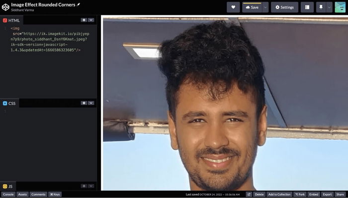
That image is huge, slow, and looks bad. First, let’s convert this into a smaller file that’s faster to load using an image editor. The space we have on our website is 400×400, so let’s reduce it to 800×800 so it looks great on retina displays. Images with smaller resolutions are smaller and will load faster.
Here, I’ll give the following styles to the image to constrain the size:
img {
  height: 400px;
  width: 400px;
}
And now I should get a smaller version of the same image as a thumbnail:
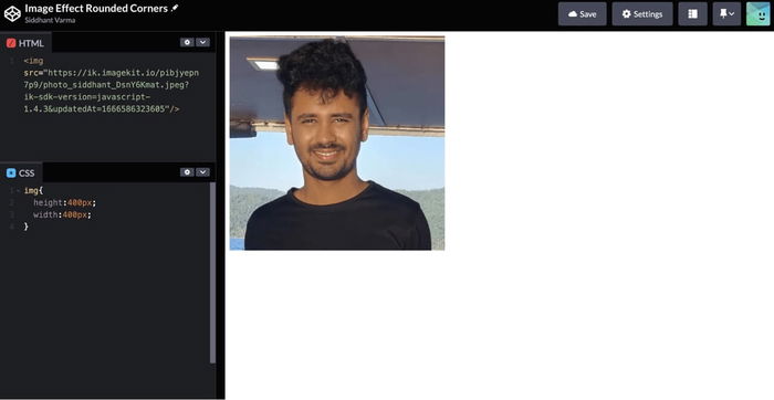
Great! Now let’s convert this thumbnail image further to a display image.
When you think of avatars or display pictures, you immediately think of round images. The CSS border-radius property can be conveniently used to give any image rounded corners. In this example, I have my own image on the CodePen with a smaller width and height just so the image looks smaller.
Notice in the CSS, we’re targeting the image via its HTML selector for setting an appropriate height and width. Here, we’ll add the following line:
border-radius: 50%;
And the image should now look circular like an avatar:
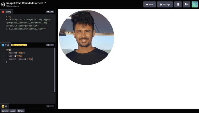
A 50% border radius sets the border-radius of an image to 50% of the height and width that the image takes. So in this case, the border-radius is set to 200px, which makes it circular. You can also manually set this value, but using 50% is a much easier and safer option for cases where you may not know the dimensions of the image beforehand.
But you’re not only limited to using border-radius for the avatars. Let’s give another CSS class to the image that sets a different border-radius:
.rounded {
  border-radius: 20px;
}
That should only make the image slightly rounded but not exactly circular:
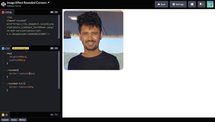
Great! You’ve learned about rounded corners image effects. Here’s the entire CodePen for this section if you want to see the code or play around with it.
Background Image
You can set a full background image under some content like a banner. In order to do so, you’ll need to use a background-image property. Let’s say that we have the following HTML template:
<div class="background-container">
  <div class="text-container">
    <p>The city that never sleeps</p>
  </div>
</div>
Here we have two containers: an outer container and an inner container. The inner container acts like a container for the text inside it. Let’s now target the outer container in the CSS and give it a background image:
.background-container {
  background-image: url("https://ik.imagekit.io/pibjyepn7p9/Screenshot_2022-10-24_at_11.19.22_AM_ddZUkshy1.png?ik-sdk-version=javascript-1.4.3&updatedAt=1666590613403");
  background-position: center;
  background-size: cover;
  background-repeat: no-repeat;
  height: 600px;
  width: auto;
  display: flex;
  align-items: center;
  justify-content: center;
}
The background-image CSS property will set the container’s background as the image specified by the URL. The background-position property specifies how this background-image needs to be positioned with respect to the container. The background-size property specifies the size of the image. Here you have options like cover, contain, etc. The cover option takes the image and sizes it according to the entire container so the image covers the entire container. Finally, we have the background-repeat property, which specifies whether the image should repeat or not if it doesn’t fit to the size of the container.
Apart from these CSS styles, we have some regular styles for flexbox layout. Now let’s also style the inner container:
.text-container {
  height: 100px;
  width: 600px;
  border-radius: 10px;
  background: black;
  color: white;
  font-size: 40px;
  font-family: sans-serif;
  display: flex;
  align-items: center;
  justify-content: center;
}
Here’s how the background image should appear now:
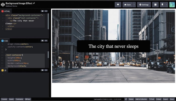
Here’s the CodePen for this if you wish to play around. Let’s move on to the next image effect.
Overlay Effect: Grayscale and Blur
You must have seen some images with their colors inverted completely to only black and white. Or the images are blurred out for some reason. Blurring out is a useful application if you want to show some images to the visitors but don’t want them to be completely visible to them unless they sign on to your website, for example.
For instance, a lot of dating apps show you pictures of potential matches that are blurred, but if you buy their premium subscription, the blurry feature goes away and you’re able to see the complete image.
For grayscale and blur, we’ll use a CSS image property called filter. You can do more with the filter property than just grayscale and blur, like adjusting the color saturation, tint, etc.
To start off, we have the same image as in the previous section, but let’s resize it a little smaller to 300 by 167 (kind of like the thumbnail effect we discussed previously, remember?) and with the following HTML template:
<img src="https://ik.imagekit.io/pibjyepn7p9/Screenshot_2022-10-24_at_11.19.22_AM_ddZUkshy1.png?ik-sdk-version=javascript-1.4.3&updatedAt=1666590613403" height="300" width="167"/>
And here are the height and width styles for the CSS, the width will be set automatically based on the height:
img {
  height: 300px;
  margin: 200px;
}
Images should be resized to be smaller and faster at this size. We can use automatic build tools to make optimizing images easy. That should have our image looking like the following:
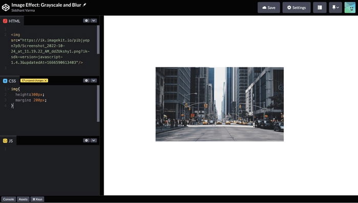
Now we’ll give the image a class called grayscale, and we’ll set the CSS styles for this class to be the following:
.grayscale {
  filter: grayscale(100%);
}
This should now turn our image to black and white:
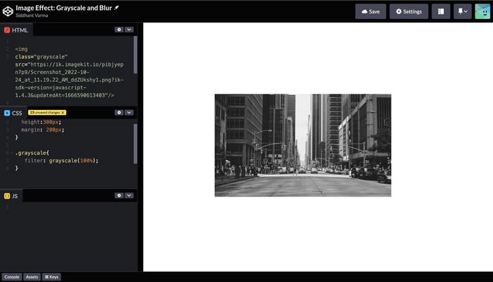
That’s how simple it is to apply the grayscale image effect to an image using the filter property! The value of 100% gives it a complete grayscale; however, you can set it to anywhere between 0 and 100.
Similarly, we can use the blur function to set a blur value. This time, we’ll set a value in pixels:
.blur {
  filter: blur(2px);
}
And that should give back a blurry image effect as shown:
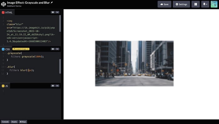
Image Shadow Effect
Let’s now learn about the shadow effects that we can apply to images. The CSS property box-shadow can be applied to all block elements, including images. It takes four length properties as parameters that you can specify to adjust the applied shadow on an element. Let’s take a look at the following example, in continuation of the previous section, where we’ll now apply some shadow to the image:
.shadow {
  box-shadow: rgba(17, 12, 46, 0.15) 0px 48px 100px 0px;
}
Here’s how that image looks:
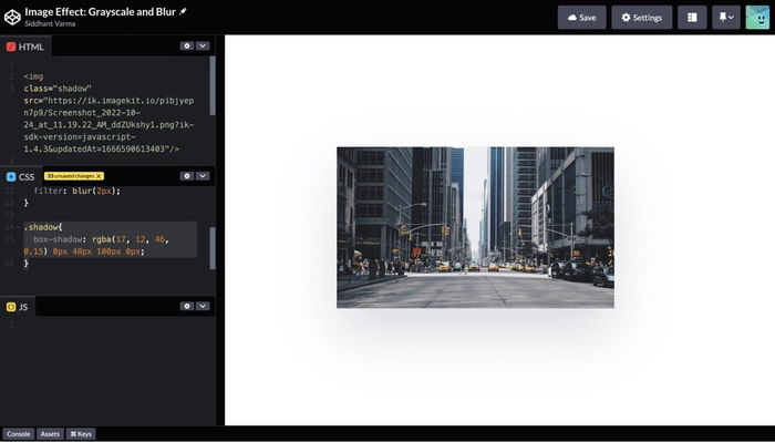
Notice how the image looks like it’s elevated with some drop shadows around it? We’ve just added some cool shadow effects to an image! Here’s the CodePen for this section and the previous section if you want to adjust the filters or shadows and get a better sense of it.
Usually drop shadows are applied on a UI element like a card. Let’s look at an example of a card with the same image. Here’s a simple template for the card:
<div class="card">
  <img src="https://ik.imagekit.io/pibjyepn7p9/Screenshot_2022-10-24_at_11.19.22_AM_ddZUkshy1.png?ik-sdk-version=javascript-1.4.3&updatedAt=1666590613403"
    height="466" width="801" alt="New York" />
  <div>
    <h3>This is a card title</h3>
    <p>This is a card text </p>
  </div>
</div>
The image is the first child element of the card’s container and then we have some text elements. Let’s apply the following styles to the above template:
.card {
  height: 400px;
  width: 400px;
  text-align: center;
  margin:200px 300px;
  box-shadow: rgba(99, 99, 99, 0.2) 0px 2px 8px 0px;
}

.card img {
  height: 200px;
  width: 400px;
}
Notice that we give a drop shadow or apply the box-shadow property to the card element and not the image itself. Here’s how that card should look:
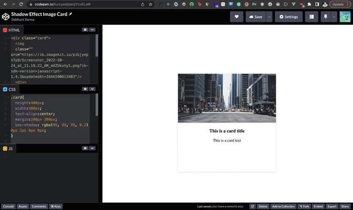
You can explore the code for the shadow effect card here.
Image Hover Effects
Sometimes you may not want to directly apply some of the image effects on the images. Instead, you can apply them based on a specific user interaction: the most common is hover. It’s easy to translate all the grayscale, blur, and shadow properties and apply them to an image only on hover using the :hover selector. Here are the CSS styles that correspond to each:
.grayscale-hover:hover {
   filter: grayscale(100%);
}

.blur-hover:hover {
  filter: blur(2px);
}

.shadow-hover:hover {
  box-shadow: rgba(17, 12, 46, 0.15) 0px 48px 100px 0px;
}
If you use any of these classes on the image, the image effect would be applied to the image only when the user hovers over it. When your mouse moves away from the image, the effect should be gone. Here’s the CodePen for this if you want to play around with it.
Conclusion
CSS effects for images can be extremely useful for conveying additional visual information or laying emphasis on images based on certain user interactions, but be careful not to slow down your website with too many or too big images There’s a ton of other stuff you can do as well. For instance, you can zoom the image using the transform property. Or you can also make the hover effects smoother using the transition property. However, remember that most of the image effects are on the heavier side of the CSS engine. This means the more shadows, transforms, and filter properties your image has, the heavier the rendering of your site’s CSS. Hence, make sure you don’t overdo it and choose these properties only wherever necessary. Check out our guide to high performance images and our other web performance articles to learn more about optimizing your website.
This post was written by Siddhant Varma. Siddhant is a full stack JavaScript developer with expertise in frontend engineering. He’s worked with scaling multiple startups in India and has experience building products in the Ed-Tech and healthcare industries. Siddhant has a passion for teaching and a knack for writing. He’s also taught programming to many graduates, helping them become better future developers.


